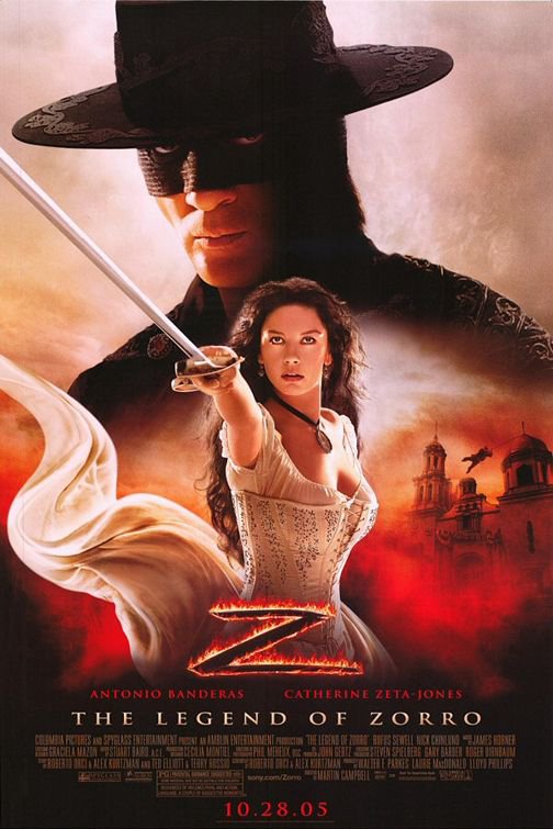
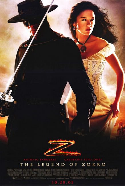
 Legend of Zorro – This falls into the “big head on top” family of movie posters (like last week’s Dreamer). Like I said before, there's nothing wrong with it – it’s a tried & true format for a movie poster. Catherine Zeta-Jones (or as we call her around here, CZJ) is looking good. If I’m not mistaken, this is the sequel to the movie that made her into a household name.
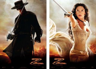
Here’s what bugs me about the poster for this movie: there were a couple of teaser posters realeased earlier this summer that showed Antonio Banderas and CZJ individually. On the final poster, they simply took these images, enlarged them or decreased them in size and pasted them together. Sin City
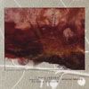
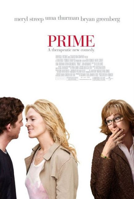 Prime – Sparse, clean layout. Simple text at the top, main characters at the bottom. No other miscellaneous clutter on the poster. This movie isn’t about the setting or the time period, it’s purely about the people. This poster says to me it’s a comedic drama about the emotional interactions between these three characters.
Somehow, I don’t think there’s going to be any explosions or gunfire in this movie.
It also says to me that Meryl Streep is doing this movie to collect a paycheck. I guess for every Bridges of Madison County needs to be balanced out with a She-Devil
.
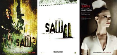
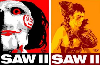
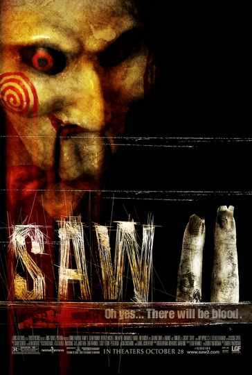 Saw II – I really like this poster, although the layout kind of reminds me of the one done for Hannibal
. Nice colors, cool "Saw" title font, really good tagline: “Oh yes…there will be blood”. Tells you exactly what you need to know (It's safe to say that this won’t be a double feature with Prime). I would have left off the two fingers in the “2”, but I guess that’s the cheeky humor in this movie.
Another thing that I like about this movie is that I've seen a bunch of posters for this movie that are all very different. I really like the variety between them – tells you someone was thinking. Movies spend so much on marketing, why can't they pay their graphic designers a little more to produce a few more designs?
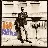
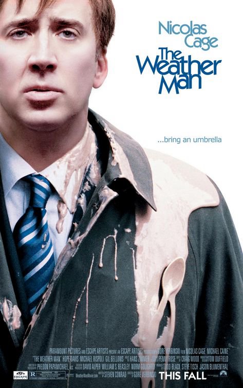 The Weatherman – This is the type of movie that Nicholas Cage should be in. I like him much more as a sympathetic loser rather than the action hero (I know he’s going to be Ghost Rider, but that’s going to be more about the special effects). Who else can do that forlorn expression? He also does good stoned look, like he did way back in Valley Girl
.
This is a pretty good poster which probably highlights the funniest part of the movie – Nicholas Cage getting pegged by food and drinks. During the trailer, I always get a kick out of seeing him get nailed in a head with a Big Gulp. That’s comedy.
Come to think of it, I have spilled a whole super-size Coke in my car before. That wasn't funny.

No comments:
Post a Comment