Thursday, December 28, 2006

Movie Poster Motifs

I was looking at some current and upcoming movie posters, and I noticed a reoccurring layout used by several of them. See if you can spot it among these three posters... it's pretty easy to see:

Yes folks, it's the silhouette of a character centered against the background of the movie's primary location. I shall call this motif: "center silhouette". This is the second reoccurring movie poster layout I've identified, the first being what I call, "big heads in the sky". This is exactly what it sounds like: the poster depicts some smaller characters or location at the bottom, and above it you have a huge disembodied head floating above it all. Here's a recent example from a Turkish movie called Ice Cream, I Scream:

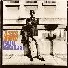
Here's another one from the new movie Freedom Writers:


See? Little people at the bottom, big Swank head above them. Yikes!

As a bonus, here's one the combines both the Center Silhouette and the Big Head in the Sky:


Score! Two Points!

Saturday, December 23, 2006

Football Fugly

Remember the kid in School of Rock that designed the fruity costumes that he wanted the band to wear? I think that kid grew up and went to the University of Oregon.

I was flipping channels the other night, and I came across the Las Vegas Bowl, which matched up Brigham Young University against the University of Oregon. At first I didn't recognize Oregon, because they were wearing these new uniforms which can only be summed up in three words:

Hid. Dee. Us.

They weren't wearing their classic green helmets with the yellow "O". Instead, they were wearing these bright, metallic yellow helmets which had kind of a sickly green tint to them. They also wore these dark green and black uniforms, which maybe weren't that bad, except for what look liked some kind of raised diamond plate pattern on the shoulder pads and knees.

Holy cow, they looked awful. What purpose could the diamond plate pattern possibly have? Wouldn't it give the opposing team a better grip on your uniform? Did Oregon lose a bet and were forced to wear these uniforms?

When you combine the bright yellow helmets with the non-slip uniforms, it makes for a pretty embarrassing combination. No wonder the Ducks got blown out 38-8.

Stand proud, boys

Monday, December 18, 2006

Archie, Say It Ain't So

I haven't read an Archie comic book since I was little, but it pains me a little that Archie and the gang will be undergoing a makeover to achieve a more "realistic" look. Here's the way I remember Archie and friends:


You remember these guys, right? Archie... his arch-nemesis Reggie... look, there's that grouchy principal, Mr. Weatherbee, screaming into Archie's ear. Well, throw that all out the window, because pretty soon they're going to look like this:

Betty? Veronica? Is that you?

Oh for Pete's sake. What really concerns me though, is what the new Jughead is going to look like. How can you improve a mug like this?

All hail Jughead!

Thursday, December 14, 2006

Hotel Hell

If you happen to be traveling through Amsterdam and you're low on euro, you might want to check out the Hans Brinker Budget Hotel. Their whole shtick is how bad their facility is - sort of a "bad is good" marketing scheme. Either that, the hotel is really, really bad.


I've never been to Amsterdam myself, so I don't really know the truth of the matter. In the meantime, check out their intentionally jacked-up website...it's pretty amusing.