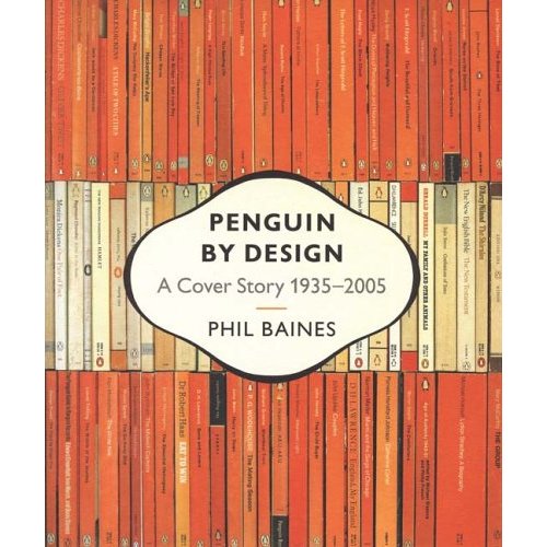
 I never realized how cool Penguin Books were until I read Penguin By Design by Phil Baines. It's a fascinating look at the evolution of the Penguin Book covers from the 1930's to the present.
In the early days, the goal was to establish the brand by maintaining consistency across the company's various imprints and subject matter. The approach was very systematic: Penguin for fiction, Puffin for children's books, and Pelican for original works on current topics. They also had color coding for their covers, with orange for fiction, green for crime, and blue for biography. The early covers had set guidelines and used restrained fonts.
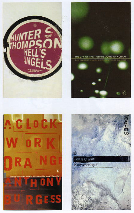
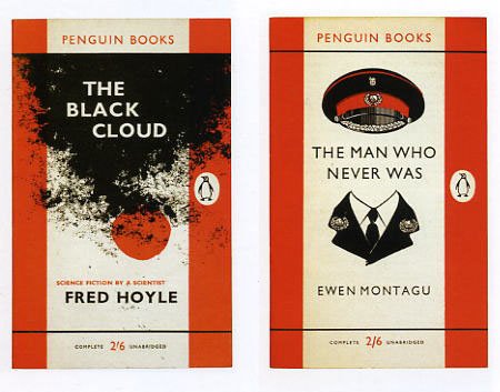 Eventually, Penguin saw the need to compete with other paperback publishers and allowed various forms of photography and illustration onto their covers. However, their covers always maintained some form of consistency in their design format that was part of the brand's identity.
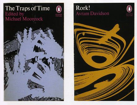
The thing about these covers is that individually, they may not always be the most eye-catching design, but put a series of them together in context with their history, then the graphic impact really comes through. Someone should put out a book showing the entire Penguin catalog - I'd buy it.


No comments:
Post a Comment