KFC recently changed their logo, and it isn't that bad. This is what they had about twenty years ago:
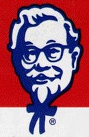
Colonel Sanders eyes and lips looked kind of funny back then. He also looked a lot like a disembodied head with a little stick figure body. The more I look at it, the more his whole head seems kind of misshapen. I didn't eat a whole lot of fried chicken back then.
Some time in the eighties (I think), they changed their logo and made the Colonel into a more realistic jolly old man:
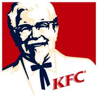 The expression on his face and the angle of his body makes him look like he's always chuckling about something. He's just a grandpa kicking back in his rocking chair. You have a problem? Don't worry about it, sonny. Here - have some chicken.
Just this month, they unveiled the new logo:
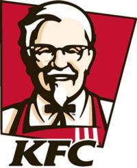
Pretty snazzy, huh? It's interesting to see that by just removing some of the detail from the Colonel's face and thickening up the line weights, he looks much more youthful. He even looks like he lost some weight.
I like the fact that the Colonel now stands up straight and wears an apron. I know he created the secret eleven herb & spice chicken recipe, but I could never imagine him actually cooking. Before he just looked like an old southern guy in a white suit who probably had his kitchen staff whip him up a bucket of fried chicken whenever he wanted.
But the new KFC Colonel isn't afraid to get his hands dirty. He's going to roll up his sleeves, skin some chickens, and be splattered with hot oil from the fryer. Go Colonel, go!


















No comments:
Post a Comment